Five charts that changed the world

Five charts that changed the world
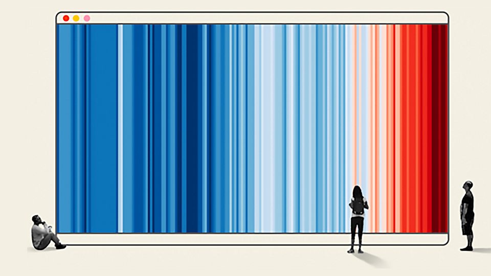
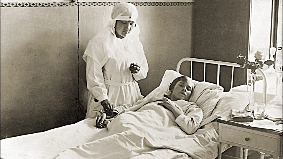
Consultant for the animation: Jason Forrest, director of the Data Visualisation Lab for McKinsey and Company. This is a pie chart. And this is Scottish political economist William Playfair, who created the world's first pie chart, along with some of the first line and bar charts. Data visualisation is everywhere today, but when Playfair first created them over 200 years ago, using shapes to represent numbers was largely sneered at. How could drawings truly represent solid scientific data? But now data visualisation has become an art form of its own. Here are five charts that have, in their own way, changed the world. One of the best known uses of data visualisation was devised in London in 1854. At the time, it was widely believed that infectious diseases like cholera were spread through the air. Surgeon John Snow felt differently. He was convinced that infections could be spread by dirty water. And when a deadly outbreak of cholera occurred in Soho, Snow tracked each case and marked them with a dot on a map. A clear picture emerged. All the deaths from cholera were clustered around a water pump on Broad Street. When he presented his findings to the local officials, the pump was shut down and the outbreak ended. Dr John Snow fundamentally changed our understanding of microbes, and his simple dot maps were a huge part of that. Around about the same time, "the lady with the lamp", Florence Nightingale, used a cunning visual to save even more lives. During the Crimean War, she realised that unsanitary conditions in hospitals were killing more soldiers than were dying on the battlefield itself. She wanted to persuade Queen Victoria, head of the British Army at the time, to fund better conditions in military hospitals. So she created the Coxcomb, a sort of uneven pie chart which showcased the data on the causes of soldiers' deaths in a highly effective way. Her efforts had sweeping impact, not only improving the sanitary conditions of army hospitals at the time, but ultimately changing the face of modern healthcare. One of the most original examples of data visualisation was created by American historian and civil rights activist W.E.B Du Bois for the 1900 Paris World's Fair. He presented a series of hand-made charts showcasing the educational, social and business accomplishments of black Americans in the 35 years since slavery had been officially abolished. The materials both challenged stereotypes and illustrated how black communities were still being discriminated against. Du Bois hoped the visualisations would help to end racial prejudice in the world. "The problem of the 20th century "is the problem of the color-line," he wrote. Although his dreams weren't realised, Du Bois' beautiful charts are now recognised as a powerful use of data visualisation to demonstrate social change. Data visualisation can also be used for misinformation, sometimes with disastrous consequences. This is the Kallikak family tree. As a chart, it's not ground-breaking, but its impact was profound. It was conjured up by Henry Goddard, an American psychologist and eugenicist who believed that one of society's greatest problems was "feeble-minded" people - basically, anyone deemed to be of lower intelligence. Goddard wrote a book based on the story of Martin Kallikak, a soldier who was married and had a family of fine, upstanding citizens. But according to the book, Martin Kallikak had a one-night stand with a "feeble-minded" barmaid. She had a son who became known as "Old Horror", who went on to father ten children. According to Goddard, feeble-mindedness was hereditary, and the family was full of what he called "the lowest types of human beings". But it was a fiction. The barmaid never existed. Even so, the Kallikak family tree could be found in school textbooks as late as the 1950s, and it was also used by the eugenics movement for decades afterwards. And it was adopted by the Nazis, who used it in propaganda films to gain support for their racial purity laws, which led to the murder of thousands of disabled people in the Holocaust. Sometimes, iconic status can be achieved almost accidentally. In 2018, scientist Ed Hawkins was invited to give a speech about climate change at Hay, a literary festival in Wales. He needed to convey the increase in global average temperatures to a largely non-scientific audience. So, he devised a chart that used no words, just colours. It was a stunningly simple way of demonstrating how the planet had warmed since 1850. The chart, known as the warming stripes, uses blues to indicate cooler than average years and reds to show years with temperatures hotter than average. Updated every year, Hawkins says 2022 was the first year that every country needed a new red stripe, demonstrating how fast the Earth's climate is changing. Although the graphic breaks some of the rules of data visualisation - it doesn't provide a title or legend - arguably, it is one of the most iconic graphics of modern times. What do you think the next chart to change the world will be?