What do colours on the BBC Weather maps mean?
- Published

We have lots of visual tools we can use to illustrate the weather forecast.
The graphics we choose depend on the forecast and the story about the weather we are trying to tell. One of the most common graphics we use is something called a temperature contour map, as seen in the image above.
The colours on the map match this temperature scale, below.

We use this scale all year around because it is a good way of showing audiences broad temperature differences. You can also see the colour scale reflected in a line at the bottom of the temperature box with the number in it.
The darker the blues or reds the colder or hotter it is. Those colours are an accepted way of expressing heat and cold. They are also easy to see for most audiences.
Have weather maps changed?
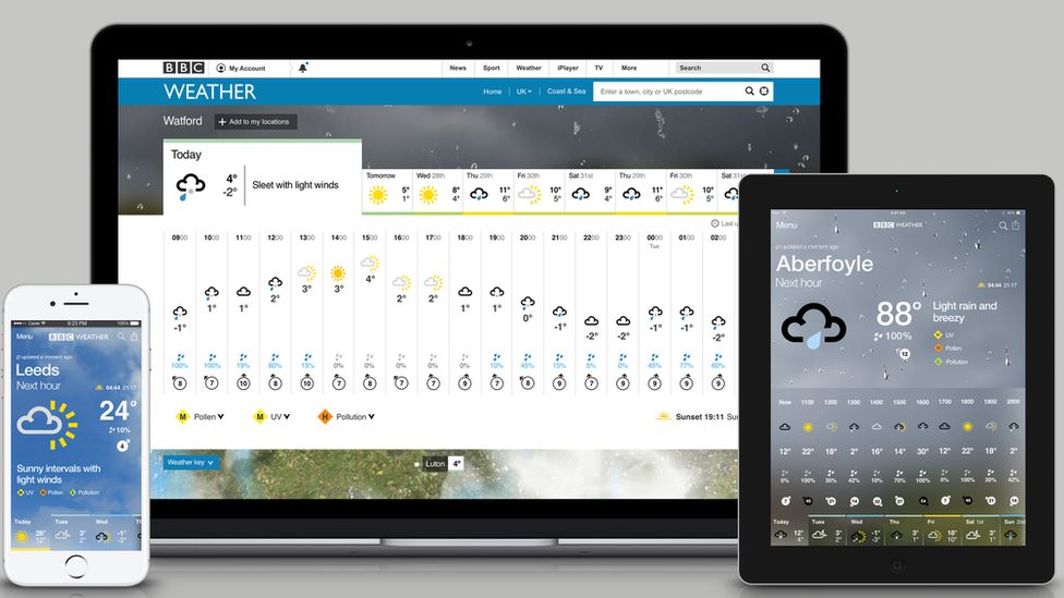
Weather maps have been updated over time along with the technology and data we use to bring you the forecast. Many of the changes to our weather graphics have been made to make our maps more accessible for people who have sight issues. We also use data driven maps on TV forecasts now rather than weather symbols such as clouds and suns.
But temperature contour maps are nothing new. We started using them in the late 1980s and then more widely in the 1990s. Below are some examples from then and now.

The last big change to BBC Weather graphics took place in 2017. The resolution and technology of our graphics have improved over the last 30 years but perhaps the biggest change was that we no longer use the "weather symbols" on our TV maps - although they still appear elsewhere, for example on our website and app.
Have you changed the map colours for greater impact?
No - there have been no changes since 2017, when amendments were made to our graphics because of improvements in forecasting and technology. The quality of weather data has changed dramatically in the last 20 years as has the digital technology we use in the BBC Weather Centre to make our forecasts. At that time we also made the graphics clearer for people who have visual impairments and who see colour differently.
There is more information about BBC Weather and how we produce our forecasts here.
- Published25 July 2023