Walgreens: Pharmacy, Health & Wellness, Photo & More for You
span { transition: 600ms; } .btn__animation--text > span { transition-timing-function: cubic-bezier(0.65, 0.05, 0.36, 1); } .btn { position: relative; min-width: 104px; height: 44px; padding: 0 20px; border-radius: 45px; background: inherit; color: #fff; overflow: hidden; font-size: 1rem; cursor: pointer; } .btn__wrap { position: relative; } .btn:active { transform: scale(0.8); } .btn span { position: relative; white-space: nowrap; z-index: 1; } .btn .icon { width: 25px; min-width: 25px; } .btn .icon span { margin-left: 8px; } .btn__circle { padding: 0; min-width: auto; width: 44px; height: 44px; border-radius: 50%; } .btn__circle .icon { min-width: 16px; width: 16px; height: 16px; } .btn__circle--small { width: 36px; height: 36px; } .btn__blue { background: #323264; } .btn__blue:hover { background: #284b9b; } .btn__tint-blue { background: #a0ebff; color: #323264; } .btn__tint-blue:hover { background: #a7dee9; } .btn__white { color: #284b9b; background: #fff; } .btn__white:hover { background: #F4F2EF; } .btn__red { color: #fff; background: #e62600; } .btn__red:hover { background: #aa0a0a; } .btn__ghost { color: #24272a; } .btn__ghost:before { content: ' '; position: absolute; width: 100%; height: 100%; border-radius: 50%; background: #a0ebff; transform: scale(0); } .btn__ghost:hover { color: #323264; } .btn__ghost:hover:before { transform: scale(1); } .btn__animation .btn { min-width: 120px; } .btn__animation--text { display: block; width: 100%; } .btn__animation--text > span { width: 100%; } .btn__animation--text > span:last-child { position: absolute; transform: translateY(44px); color: #284b9b; } .btn__animation--text > span .icon { min-width: 14px; width: 14px; min-height: 14px; transition: 0ms; } .btn__animation[aria-pressed="true"] { pointer-events: none; } .btn__animation[aria-pressed="true"] .btn { background: #fff; border: 1px solid #284b9b; } .btn__animation[aria-pressed="true"] .btn__animation--text > span:first-child { transform: translateY(-44px); } .btn__animation[aria-pressed="true"] .btn__animation--text > span:last-child { transform: translateY(0px); transition-delay: 150ms; } body { font-family: "Source Sans Pro", sans-serif; font-weight: 400; } strong { font-family: "Source Sans Pro", sans-serif; font-weight: 700; } a, button { transition: 300ms; } a, button { position: relative; color: #413D3C; text-decoration: none; cursor: pointer; } a[disabled], button[disabled] { pointer-events: none; color: #737878 !important; } a[disabled] .btn, button[disabled] .btn { background: #d9dada !important; color: inherit; } button { background: none; line-height: 1; } body { font-family: "Source Sans Pro", sans-serif; font-weight: 400; } strong { font-family: "Source Sans Pro", sans-serif; font-weight: 700; } a, button { transition: 300ms; } p { font-size: 1.125rem; line-height: 1.78; } p:not(:last-child) { margin-bottom: 20px; } .text__white { color: #fff; } .text__red { color: #e63214; } .text__blue { color: #284b9b; } .text__tint-blue { color: #a0ebff; } .text__dark-blue { color: #323264; } .page__home-page .list__contain--align-center { display: flex; } .page__home-page ul, ul.list__inline, ul.list__inline-right, .page__home-page ul.list__inline-left, ul.list__vertical li { display: flex; flex-wrap: wrap; } .page__home-page .list__contain--align-center { justify-content: center; } .page__home-page ul.list__vertical li { align-items: center; } .page__home-page ul.list__inline-left { justify-content: flex-start; } .page__home-page ul.list__inline-right { justify-content: flex-end; } .page__home-page ul.list__vertical li > a:before { transition: 300ms; } .page__home-page .list__contain { position: relative; width: 100%; } .page__home-page .list__contain--align { margin-left: -15px; } .page__home-page ul.list__bullet, ul.list__numbered { margin-left: 15px; } .page__home-page ul.list__bullet li, ul.list__numbered li { display: list-item !important; padding: 4px 0; line-height: 1.4; } .page__home-page ul.list__bullet ul, ul.list__numbered ul { margin-top: 8px; font-size: 0.875rem; } .page__home-page ul.list__bullet ul li, ul.list__numbered ul li { padding: 2px 0; } .page__home-page ul.list__bullet { list-style: disc; margin-left: 20px; } .page__home-page ul.list__numbered { list-style: decimal; margin-left: 15px; } .page__home-page ul.list__vertical > ul { width: 100%; } .page__home-page ul.list__vertical li { flex-flow: nowrap; width: 100%; padding: 4px 0; margin-right: 0; line-height: 1; } .page__home-page ul.list__vertical li > .icon { margin-right: 16px; } .page__home-page ul.list__vertical li > a { width: 100%; padding: 12px 16px; } .page__home-page ul.list__vertical li > a:before { content: ' '; position: absolute; top: 0; left: 0; width: 100%; height: 100%; background: #f8f8f8; border-radius: 8px; opacity: 0; z-index: 0; transition-delay: 10ms; } ul.list__vertical li > a span { position: relative; z-index: 1; } .page__home-page ul.list__vertical li > a:hover:before, .page__home-page ul.list__vertical li > a:focus:before { opacity: 1; } .page__home-page ul.list__vertical.list__links li { padding: 0; } .page__home-page ul.list__vertical--large li { padding: 12px 0; line-height: 1.4; } .page__home-page .list__column--3 li { width: calc( 33% - 16px); } @media (max-width: 767px) { .page__home-page .list__column--3 li { width: 100%; margin-bottom: 24px; } .page__home-page .list__column--3 li:not(:last-child) { margin-right: 0; } } .page__home-page .list__vertical.list__column--2 li { width: 50%; } .card__contain, .card__hero, .card__img--thumb, .card__product--img, .card__bg--img { display: flex; } .card { display: inline-flex; } .card__content { display: flex; flex-wrap: wrap; } .card__content > div{ width: 100%; } .card__content { display: flex; flex-wrap: wrap; justify-content: space-between; } .card, .card__hero, .card__product--img, .card__bg--img { justify-content: center; } .card, .card__hero, .card__product--img, .card__bg--img, .card__content { align-items: center; } .card { flex-direction: column; position: relative; width: 100%; height: 100%; background: #fff; border-radius: 16px; box-shadow: 0px 1px 6px 1px rgba(64, 64, 64, 0.1); border: 1px solid #efefef; font-size: 1rem; line-height: 1.4; overflow: hidden; } .card__no-styling { box-shadow: none; border: none; background: none; } .card .heading { line-height: 1.1; } .card__outline { box-shadow: none; border: 1px solid #a5aaaa; } .card__contain { position: relative; height: 100%; width: 100%; } .card__contain:not(:last-child) { margin-bottom: 16px; } .card__hero { width: 100%; } .card__hero--none { height: auto; } .card__hero img { min-height: 210px; } .card__hero--left { justify-content: flex-start; padding-top: 24px; } .card__hero--left img { width: 90%; } .card__content { align-content: flex-start; flex-direction: column; position: relative; width: 85%; height: 100%; margin: 0 auto; padding: 24px 0; z-index: 1; } .card__content > a { align-self: flex-end; width: 100%; } .card__content .btn__contain { align-self: flex-end; width: 100%; padding-top: 28px; } .card__img { box-shadow: none; border: none; } .card__img--thumb { width: 50px; margin-right: 16px; } .card__img--thumb div { width: calc(100% - 66px); } .card__product--img { position: relative; min-width: 115px; width: 115px; margin: 0 auto; } .card__bg--img { position: relative; width: 100%; height: 100%; object-fit: cover; z-index: 0; } .card__bg--img img { min-height: 100%; object-fit: cover; } .card__bg--img .card__content { position: absolute; top: 0; left: 0; width: 100%; padding: 24px 32px 24px 20px; } .card__contain .flag { position: absolute; top: 0; right: 0; } .card__contain .flag__v1 { transform: translate3d(20px, -20px, 0); } .card .heading div { margin-top: 8px; } .card .heading .heading__marketing--small { line-height: 1; } .card p { font-size: 1rem; line-height: 1.4; } .card__cream { background: #F4F2EF; box-shadow: none; border: none; } .card__red { background: #e62600; color: #fff; border: none; } .card__dark-blue { background: #323264; color: #fff; border: none; } .card__align--bottom { align-self: flex-end; } .card__item--inline { display: flex; flex-wrap: wrap; } .card__item--inline { align-items: center; } .card__item { position: relative; width: 100%; line-height: 1.3; margin-bottom: 0;} .card__item--inline > div:not(:last-child) { margin-right: 32px; } .card__item--expiration { margin-bottom: 4px; font-size: 0.875rem; } .card__item--brand { font-size: 1.375rem; } .card__item--deal { color: #e62600; font-size: 1.125rem; } .card__item--descp { line-height: 1.5; color: #0A1414; } .card__item:not(:last-child) { margin-bottom: 8px; } .brand__logos, .brand__logos ul { display: flex; flex-wrap: wrap; } .brand__logos ul { align-items: center; } .brand__logos { position: relative; width: 100%; } .brand__logos .heading { width: 100%; margin-bottom: 24px; } .brand__logos .list__contain { width: 100%; } .brand__logos--thumb li { width: calc( 10% - 16px); min-width: 85px; text-align: center; padding: 8px 0; } .brand__logos--thumb img { width: 65px; } .card .heading div { margin-top: 0; } .grid__columns--6 > .content { width: 16.66%; padding: 0 8px; } .account-dropdown{ flex-direction: column; } .account-dropdown li { width: 100% !important; margin-right: 0 !important; flex-direction: column; } li.sign-in-register{ flex-direction: row !important; } @media(max-width: 767px){ .slider__wrap .contain{ padding: 0 2.5%;}} .carousel-cell{ border: none !important} .card__blue { background-color: #284b9b; color: #ffffff; border: none; }


50% off
Everything Photo
Everything Photo
Last chance to save on custom
Mother’s Day gifts
Mother’s Day gifts
50% off Everything Photo
Last chance to save on custom Mother’s Day gifts

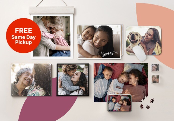
FREE Same Day Pickup on Prints, Photo Books and more
Get a clearer picture of your health in one place.
No more toggling between different apps, portals & passwords
Get a clearer picture of your health in one place.
No more toggling between different apps, portals & passwords


Rx delivery available on prescription refills
Connect with providers in minutes
Connect with providers in minutes


Find healthcare, prescription coverage & savings with these personalized tools
Exclusive offers for you
Get weekly deals, valuable health information and more.
Join myWalgreens® today
An easier way to save, shop and stay well.
Get our FREE app
Refill prescriptions, print photos, clip coupons and more.


Find a Walgreens near you
Search your nearest 24-hour store, drive-thru pharmacy, photo lab and more.
Top Brands


